Looking For A Correction In Gold… [Dirty Dozen]
“When a trader starts to feel really smart, he/she is headed for a huge drawdown.” ~ Peter Brandt (h/t Walter Deemer)
In this week’s Dirty Dozen [CHART PACK] we cover crashing fund flows, an aging Risk Cycle, mild intermediate sentiment, stretched gold, a confirmed breakout in a potash producer, and a major squeeze in currencies, plus more…
1. We hit the 19k level and upper weekly band that we pointed out last week. As we’ll show, the primary path of least resistance is still up but we could see some sideways chop here for a few weeks as the index consolidates its gains over the past month.

2. One interesting development we’re seeing is in aggregated index fund flows (bottom left chart). This indicator crossed above 90% back in March, triggering a sell signal that preceded the April correction in stocks. It’s since dropped down to 16%, just shy of the 10% or below needed for a buy signal.

3. Red and green highlighted areas mark past sell and buy signals respectively. Something to keep an eye on in the weeks ahead.

4. Our intermediate measures of sentiment and positioning continue to paint a mostly neutral to slightly optimistic consensus. But pulling further out we like to look at FINRA Margin Debt on a YoY basis as a measure of the larger Risk Cycle. When we see this data point cross above 90% it means investors are getting out over their skis and that’s when bad things tend to happen. We’re currently at 75% and climbing.

5. But to our point of more measured intermediate sentiment, BofA’s Bull & Bear indicator is sitting a 5.6, well within neutral territory.

6. Here’s the latest returns heat map. Stand outs are India (INDA) with the only numbers in the green from a global index outside of QQQ last week. And Turkey (TUR) is still leading equity index returns putting up 50% over the past year.

7. A setup to watch in small-caps. Chart and tweet from @PeterLBrandt:
Third Time a Charm
Russell 2000 headed to 2,400
Take this one to the bank
$M2K_F

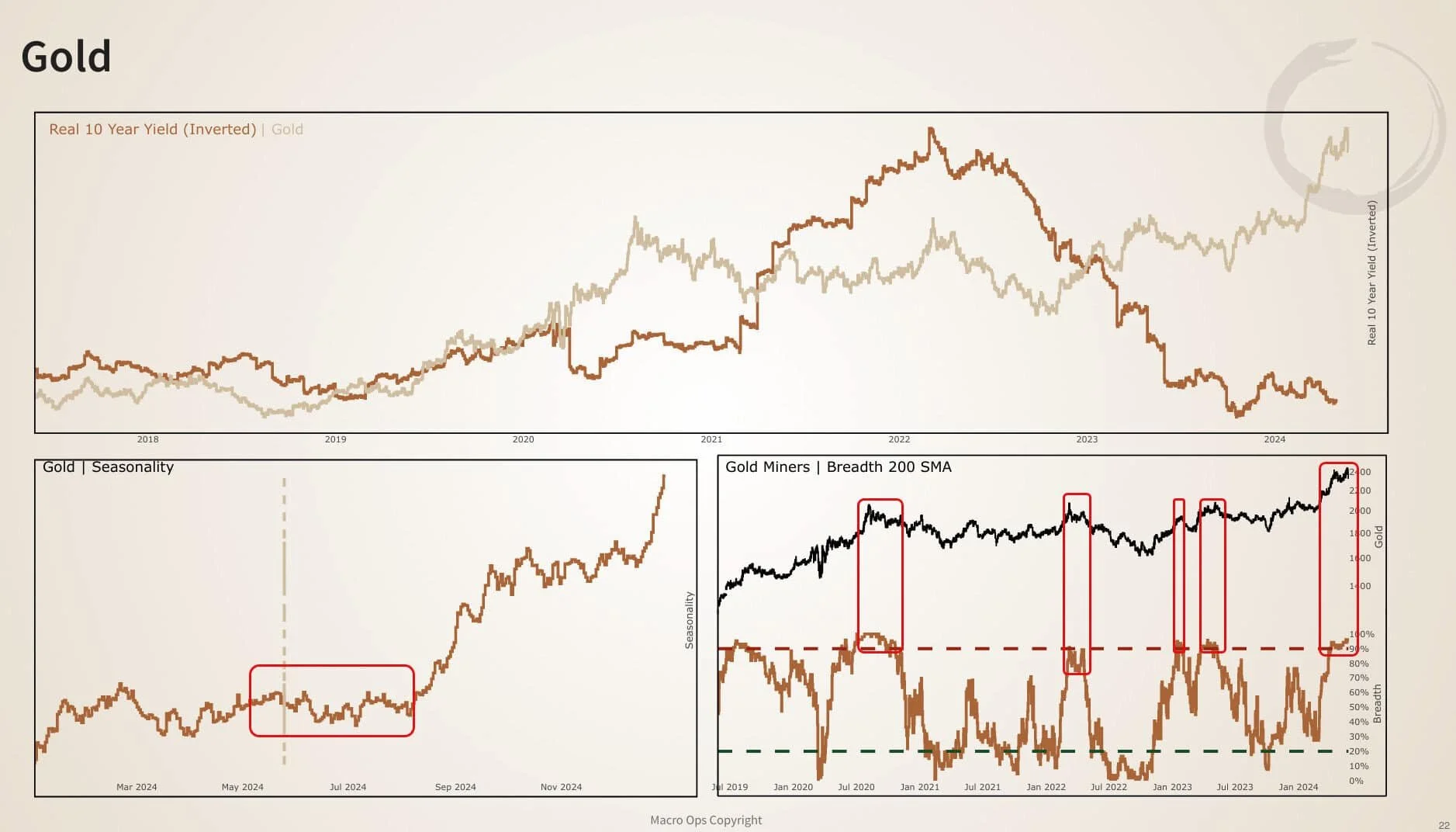
8. We’ve been vocal precious bulls for the past 9-months and our book is still loaded up with gold, silver, and some select miners. But we’re also entering an environment of poor seasonality, extended breadth, and extended technicals that may lead to a correction in the near future…

9. Here’s a look at the spread between the price of gold and its 20 week moving average. Yellow dots on the chart below mark past instances where the spread widened to above 12.5%, as we’ve recently seen.

10. There’ve been 14 other instances over the past 25yrs with six seeing gains over the subsequent 10 weeks and 8 being losers. The average (yellow line) return was -0.09%. Not exactly terrifying stats and if you extend the study out to 20 weeks you see average returns inflect higher proving the adage that momentum begets further momentum.
Our read on this is to expect a period of sideways to slightly down chop and vol for a bit as the market shakes out weak hands. And use this time as an opportunity to add to your longs when given technical setups to do so.

11. The small-cap potash producer Intrepid Potash (IPI) confirmed its breakout from its 12-month base last week. We pitched this name a few weeks ago in these pages (link here).

12. USDCNH is the most interesting macro chart to me at present moment. It’s in a major compression regime with the chart below showing weekly Bollinger Bandwidth getting squeezy. Compression regimes like these tend to lead to major expansionary regimes (ie, big trends). There’s strong opinions on both sides on which way this pair breaks (I lean higher). But ultimately I don’t care as this setup is directionally agnostic and we can just wait for the market to tip its hand.

Thanks for reading.


